
The Times Concise Atlas of the World: 14th Edition (Times Atlas)
A**
Well worth the prestige.
This Concise Atlas of the World (14th end) by The Times (2020) has a high quality and premium look and feel. It’s very detailed. It will certainly appeal to anyone with an interest in geography but will also undoubtedly be enjoyed for a huge range of purposes.I’m even more thrilled because as much as the book is clearly worth it’s retail price of £80, I may have been apprehensive to spend so much. However, I came across it at a much reduced cost of £26! So I obviously snapped it up immediately! Just a few hours later the price had almost doubled! Bonus spot!
W**T
Concise and detailed information
Everything I want in an atlas
D**R
Amazing product
Bought this as a present for my parents. There is a more up to date version costing at least twice the price, but they were ecstatic with it! Got so much in it, amazing buy
A**R
Stunning book but slightly damaged
The book itself is stunning and comes in a nice cover. Unfortunately my one appears to have been dropped or damaged and the corner of both the case and book has been damaged. Couldn’t wait to send it back and get a replacement as it was bought for a gift. Still a high review as, other than this, the book is pretty special.
P**G
Check the price before buying.
Probably the best and most comprehensive atlas available today. However I would not have bought it at the recommended price of £90. I got it when the price dropped to half . An excellent buy at the lower price.
J**L
Beautiful
Bigger than I thought it would be (didn’t read the size carefully) but it is beautiful and such amazing quality.
C**S
Amazing!!
Have bought two of these atlases for Christmas presents. They are amazing atlases and amazing price. Highly recommended and highly recommend Seller.
M**S
would be very useful for
brillant atlas, so much information and shows our the world countries have changed since the 1970's, will help uswith crossword clues, would be very useful for students
N**S
My dad loves it.
I bought this for my dad’s birthday because he loves maps and general trivia. This is the best of both. He likes watching quiz trivia shows and this book is handy. Beautiful maps and lovely quality.
D**N
The best atlas
The best atlas
A**N
chybí mi další typy map jako jsou geologické, biologické, historické, průmyslové
obsahuje jen geografické mapy
D**N
Contemporary world data is shown precisely as possible, despite on dirty and some mistakes
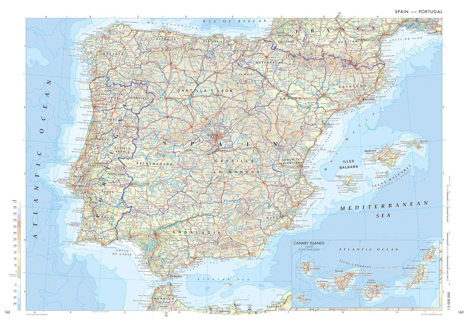
First of all I should say that I've got the atlas with a perceptible dint in corner of both case and book. It's not crucial, but it was unpleasant.Well, let's start the review of the new one.I was raised with a Soviet map tradition and I'm sure that Soviet style of maps and atlases was benchmark. So now I compare new maps with that production of 1960s, 1970s and 1980s.This is my first The Times Atlas, and it was interesting to me how British editors see the world I met with Soviet atlases and the world I know thanks to Google Maps, OSM, etc. And one question I'd like to ask: can someone keep an oldschool? :-)Common notesThis book is weighty and looks persuasive. I keep it in hands and belive I've got a solid product. It has a modern design but I feel some continuity.The paper is dense enough and glance. Probably glance looks more expensive, but it glares and makes reading difficult. Pages with index are matt and whiter, I'd prefer see maps on such paper.Sequence of maps is not usual for me. Oceania first, than keep west: Asia, Europe, Africa, and Americas. I thought Europe (and the UK) would be first.Some maps near the equator are given in Mercator projection. It was surprise to me because I believe it gives unacceptable distortions at 10+ degrees, but editors use it for 20+ degrees, too.Density of signed and labeled populated places is extremely high. I counted 248 places in 1 sq. dm (as example in NE France). In Soviet tradition maximal density is 140 places in 1 sq. dm.PlusesNative names. Editors use local and native transliterated names in most cases as possible: cities, orographic and hydrographic objects, historical regions (but not countries). E.g. West Siberian Plain is labeled as Russians pronounce it: "Zapadno-Sibirskaya Ravnina (West Siberian Plain)". They use latin, but not English letters only: Ō, Æ, È, Đ, etc. Well this is respectfully for all non-English cultures, and we should greet it. In Russian maps we see mostly Russian names, and sometimes local names in brackets.Laconic way to label disputed areas. Only dashed lines are used and simply labeled, e.g. "Jammu and Kashmir. Administred by India, claimed by Pakistan". In Soviet tradition we used to see might all disputed borders according to official position of USSR government, and used to read large explanations in some cases.Labels along parallels. I'm tired to see modern maps where all labels are given straight. Good practice is to turn them according to latitudes direction.Yellow colour for built-up areas. It looks good.MinusesBlack colour of all labels. In combination with extra-high density it makes map dirty. Using blue color for hydrographic objects and red color for countries/regions names would make maps easier for reading.Using local names leads to one big minus: we often don't understand what is the type of the object. Can you quickly recognize that "Gora Belukha" is Mountain Belukha? And that "El'brus" is Mountain Elbrus? In Russian tradition all mountains are labeled as "г." (abbrev. from "гора" — mountain) so you don't have to think whether this is a top of a mountain, or pass, or ridge, or village. The same way is used labeling ridges ("хр.", "хребет"), planes ("равнина"), bays ("зал.", "залив"), islands ("о.", "остров"), peninsulas ("п-ов", "полуостров"), etc.Most part of Russia is shown at the same scale as Antarctica. It's offensive a little, but it characterizes attitude. And I think it shows significance of Asian part of Russia for the Britain. OK, let's turn the other cheek :-)Bad generalization in some cases. Borders and rivers sometimes are very twisted, and editors didn't simplified them. So we see dirty spots that are impossible to read.Different scales. There are no clear and precise set of scales. Each map is shown in scale that fits to page size for the best. That's why we see neighbour maps in close but different scales: 12 km and 15 km (in 1 cm). Or 60 km and 72 km. Or 30 km, and 36 km, and 22.5 km, etc. I believe that set of scales should be strict: 10 km, 20 km, 50 km, 100 km. Intermediate scales (15 km, 30 km, 60 km) are possible, but they should be used not once or twice, but for considerable number of maps.Well, mistakes. They are seemed to be not crucial, but I see mistakes in population data (some cases in Russia, Kazakhstan, Brazil, China), road network data (in Russia, Ukraine, Kazakhstan, Mongolia, China), railroad network (Mongolia, Saudi Arabia), nature objects (sands in Gobi Desert are not shown), other (national parks and nature reserves in Russia, China are not shown).ConclusionAnyway the new Concise Times Atlas is very interesting and useful book. It is based on contemporary world data, and shows it precisely as possible, despite on some mistakes.That's pity that Soviet tradition of maps is died, and the most Russian maps even cannot be compared with it. Surely, The Times Atlas is benchmark now, and I trust that many things somewhen would be done better.
E**E
A slightly smaller & much cheaper version of the Times Comprehensive Atlas
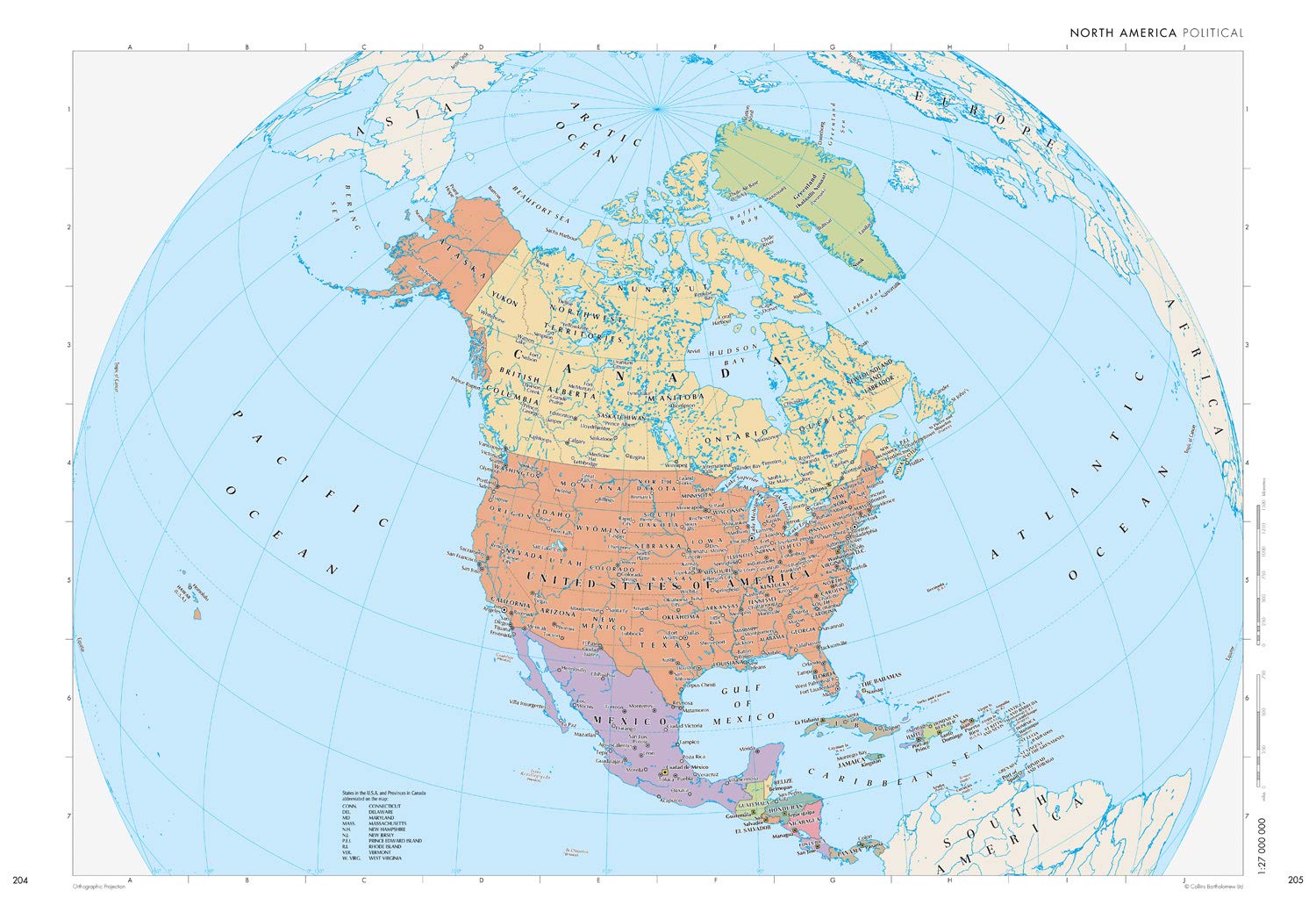
This atlas has most of the maps and features of the top of the line Times Atlas of the World but in a more usable size and much better price. There are 214 pages of maps including a new one showing Covid-19 cases. Major countries have a whole country double page map followed by more detailed regional maps. I prefer this Bartholomew cartography which uses pastel colors to show elevations and has easy to read fonts. There are no historical maps as described in the above Amazon write-up which I believe is describing the much smaller Times Universal Atlas.I did not give this 5 stars mostly because I think the organization could be improved to make access easier and there should be more detailed maps of major English speaking countries. Europe has the best coverage with many regional maps. For example there are 4 maps to cover Italy. However in the US the state of Florida, a major tourist destination, is only covered in a map of the entire Eastern US. All of Europe is covered with 1:2,000,000 scale maps or better but there is only one map of that scale for the US and none for Canada, Australia or India. Usability of the Atlas could be improved by including an index to map symbols on a bookmark or the end-papers instead of being hidden on page 44. Likewise a quick index of countries could be included. Currently there is a list of countries (page 22) with some demographic info for each but no page number for the map of the country is included there. There is a colorful page of nice climate graphs for 52 apparently random cities in alphabetical order. This information would be much more useful if the cities were marked on a world map so I could find one near the area I was interest in.Online maps are good for driving directions but if you zoom out to see some context you loose too much detail. Printed maps like in this atlas provide a size and quality that allow you to see details and context. I am a fan of printed atlases.
Trustpilot
1 week ago
1 week ago